BRANDING & PACKAGING
Kona Brewing Co.
Objective
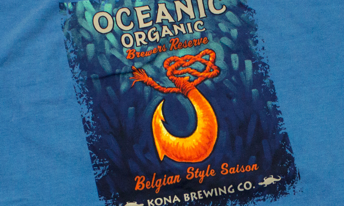
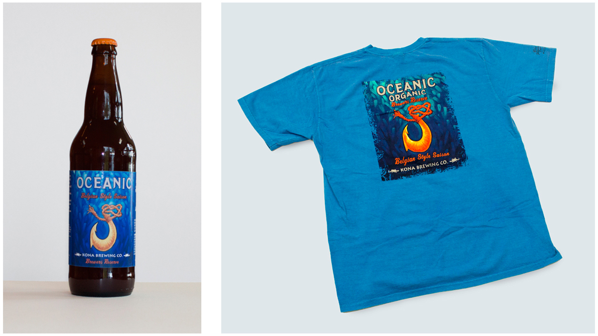
The Kona Brewing Company (KBC) on Hawaii's Big Island frequently creates special limited releases of unique beers. For one of those beers - the "Oceanic Organic" Belgian Saison - I worked with KBC's CEO and brewmaster to create an image that would reflect the beer’s refreshing quality but still work within KBC’s existing layout.
Solution
A dynamic and eye-catching illustration that taps into Hawaii's history, evokes the blue Pacific Ocean, and is as fresh as the beer. (Note: Because KBC has an established wordmark and typography I did not create those.)
Tasks & Tools
- Research and concept development
- Oil Paint
- Photoshop
Process
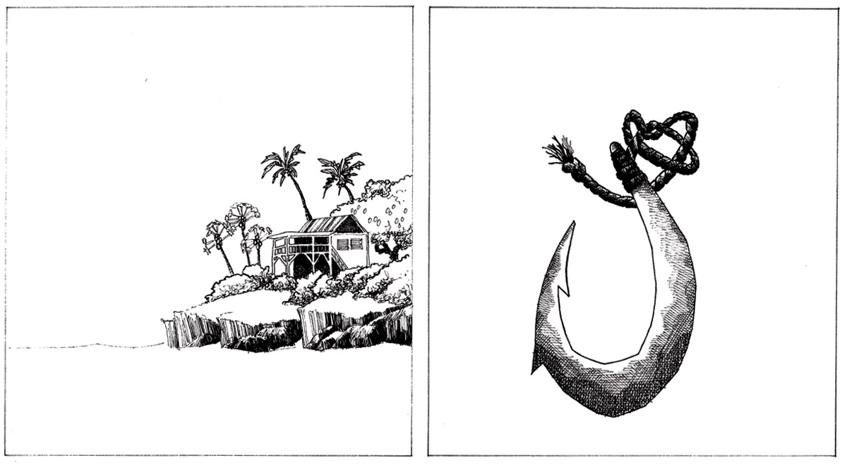
After talking with the brewmaster, I created several drawings of potential label designs. These are just two of many.
Final Label
After much discussion with the brewmaster and after gaining input from Kona's CEO and staff, we decided to create an illustration based on the hook idea. The traditional Hawaiian fish hook, or "makau," represent good luck and strength as well as prosperity. And it's obviously closely connected with the Ocean.
Ketchikan Salmon

Objective
Create an engaging brand and design the packaging for boxes of smoked salmon sold in the Pike's Place Market area.
Solution
I created a design that evokes the aesthetics of fish canning from the early 1900s and tells a story about tradition and quality. This design should appeal to the customer base, which consists in large part of tourists and people who buy boxes of salmon as gifts for others.
Tasks & Tools
- Research and concept development
- Illustrator
- Dieline Preparation
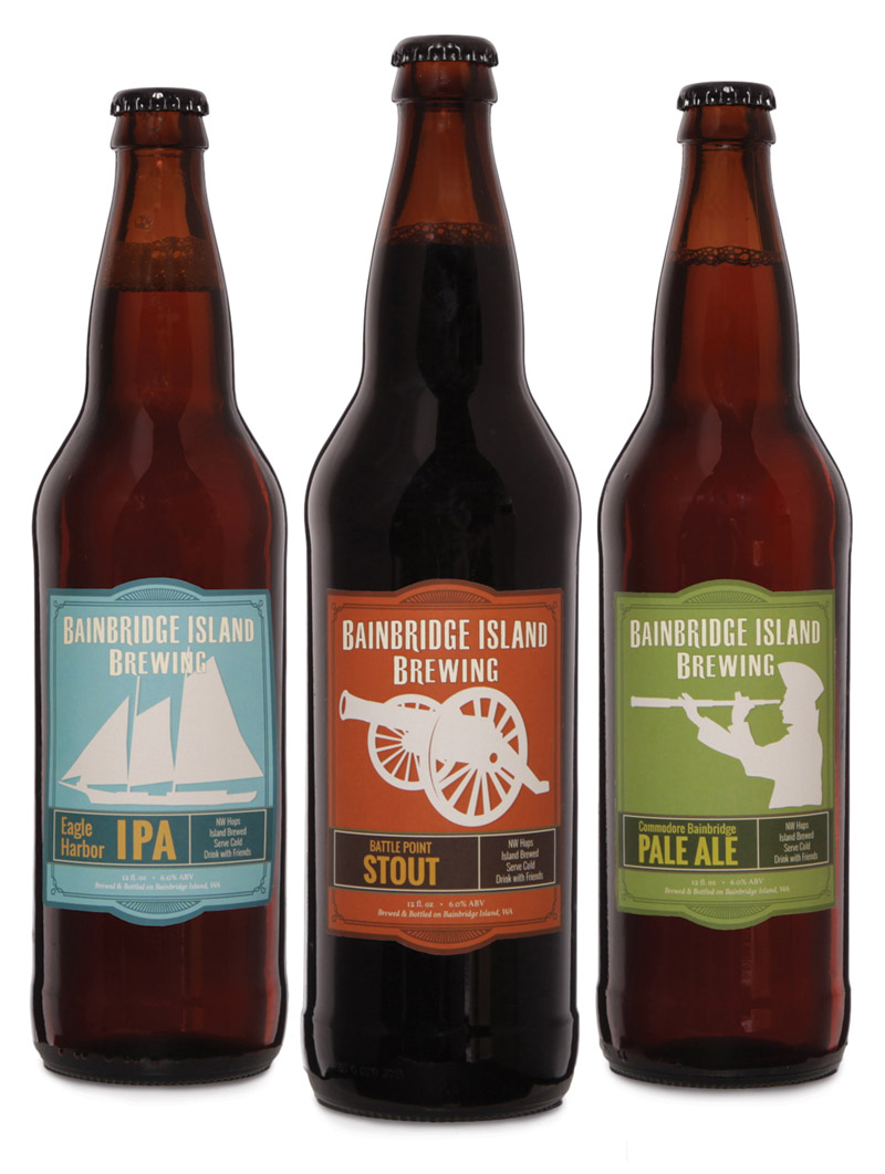
Bainbridge Brewing

Objective
For this school project, my goal was to create a comprehensive brand that communicates Bainbridge Island Brewery's approach to beer, food, and the local community. Update its website so it reinforces that brand, provides a better user experience, and increases traffic and purchases.
Solution
Because the brewmaster crafts beers in a traditional style but tailored to modern tastes, the rebranding uses traditional elements rendered in a modern style. The revised website uses the same look and feel. It also makes navigation easy and simplifies the layouts.
Branding Tasks & Tools
- Market Research
- User Research
- Mood Board
- Illustrator
- InDesign
- Dielines
Digital Tasks & Tools
- Market Research
- User Research
- Site Map
- Wireframes
- User Testing
- Photoshop
- WordPress
- HTML5/CSS3
Varolio
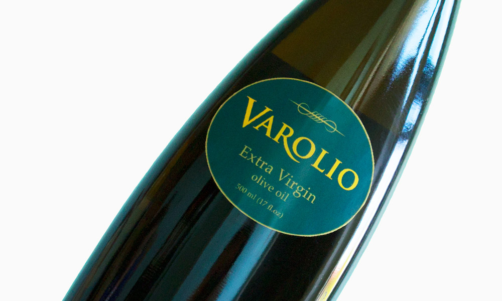
Objective
Create a brand and design the packaging for a high-end olive oil.
Solution
To convey a sense of extreme quality, my design relies primarily on typography and only one simple graphic flourish. Specifically, for the main wordmark, I used the classic Trajan and modified its "R." I combined that with Palatino. The color combination is teal and gold. I created the single graphic flourish in Illustrator.
Tasks & Tools
- Research and concept development
- Illustrator
- Dieline Preparation
Manna
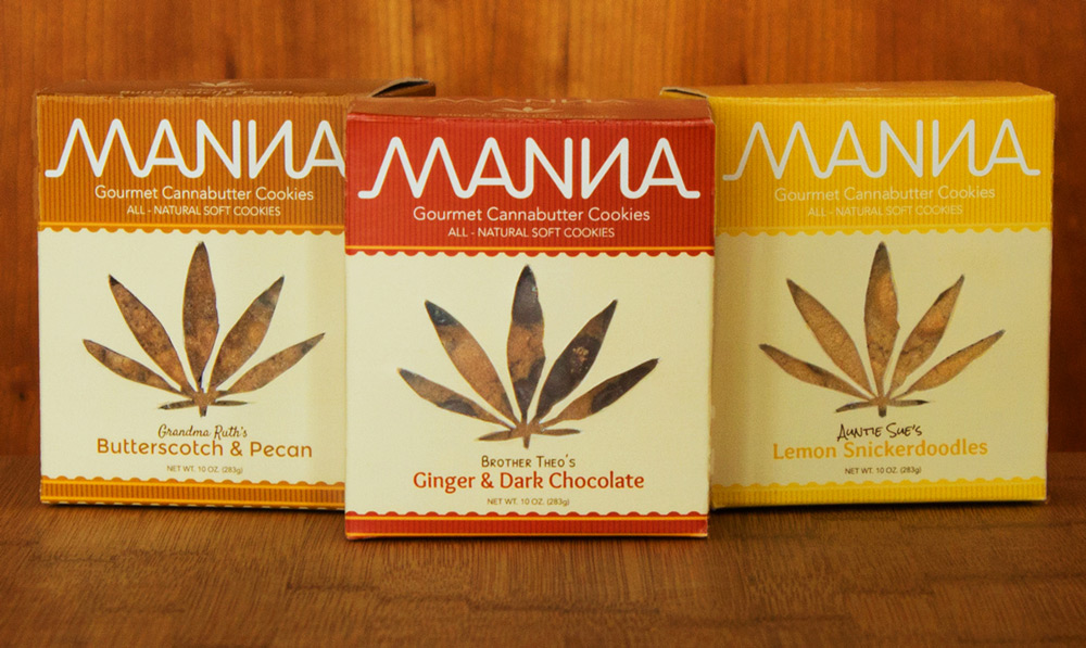
Objective
With the passage of Washington's Initiative 502, there will be great demand for new cannabis designs. The objective with this project was to create professional packaging for cannabutter cookies that avoids stereotypes, fits within the cookie genre, and both informs and entices consumers.
Solution
My solution is a design clearly conveys that these cookies contain cannabutter but also uses the colors, typography, and elements that consumers expect to see with cookies.
Tasks & Tools
- Research and concept development
- Illustrator
- Dieline Preparation